I joined a large in-house application software development team (about 80 people) at Volvo as the only designer. The team included developers, testers, and business analysts. The desktop application they built and maintained, called VIDA, was a critical tool used every day by 25,000 technicians servicing Volvo cars worldwide. I first had to understand the application’s purpose and how it served (or failed to serve) its users.
The VIDA application was developed for Windows and deployed to the PCs of every technician in every workshop servicing Volvo cars. It was used for a variety of tasks including diagnosing and updating the onboard electronic systems inside cars. (Modern cars contain upwards of 70 to 100 electronic control units.) VIDA also provided access to a parts ordering database, technical references and procedures for repairs, warranty information, and integrated with customer databases for scheduling and invoicing.
The application was more than 10 years old, having last been redesigned and rebuilt about 5 years earlier. It had grown organically since then without further design input. Its functionality and underlying technical complexity were so vast that it was difficult to know where to begin with trying to improve it. Within the overall team, there were multiple agile development teams working in parallel to improve and expand different areas of the application.
I was asked to provide design support to some of the current development projects that were already under way, and participate in new initiatives.
I met with primary stakeholders from the business side of the operation, called Service Management. They had ownership of the technician workflow related to servicing vehicles, and developed a standardised global level of training and operation for all technicians. This was documented in a long and verbose PowerPoint deck. I translated this into the following process flow, so that I could have a high level overview and see where VIDA and other systems were used within it:


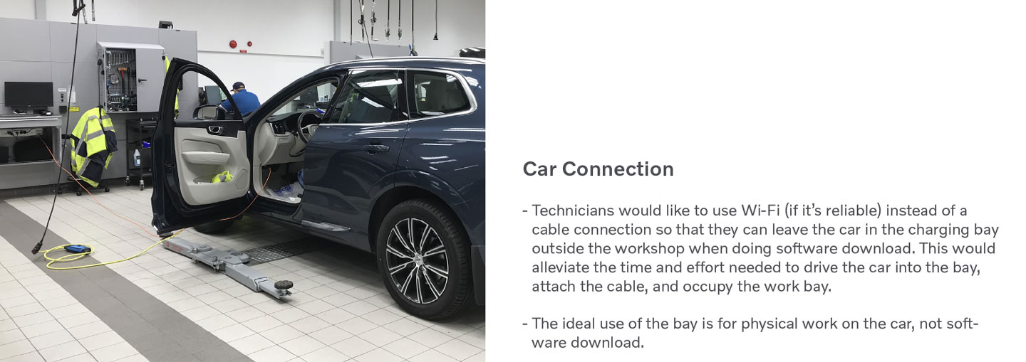
Although I had previously worked on another related application (TIE), to understand the purpose of VIDA required deeper immersion into the world of vehicle servicing. I needed to see first-hand how technicians actually worked, and how the software fit into and supported their overall workflow, because VIDA was used at many stages in the process. To do this, I requested visits to Volvo workshops to observe and interview technicians and their managers. There were 3 visits to workshops in Sweden and Belgium that had adopted Volvo’s standardised process.


From these visits, I was able to gain a much better understanding of what the technicians did, how they used the software, and some of the challenges they faced in their daily tasks. I reported the findings from these back to the business and to the development team, to highlight where efforts should be directed in improving the software. I also used these insights as the basis for improving the design of the application.


Some of the insights:
The business was focused on improving particular high-impact areas of workflow related to the technician’s daily activities. I assessed the usability of the software at a more detailed level in these areas in particular. One such area in VIDA was called the Work List.
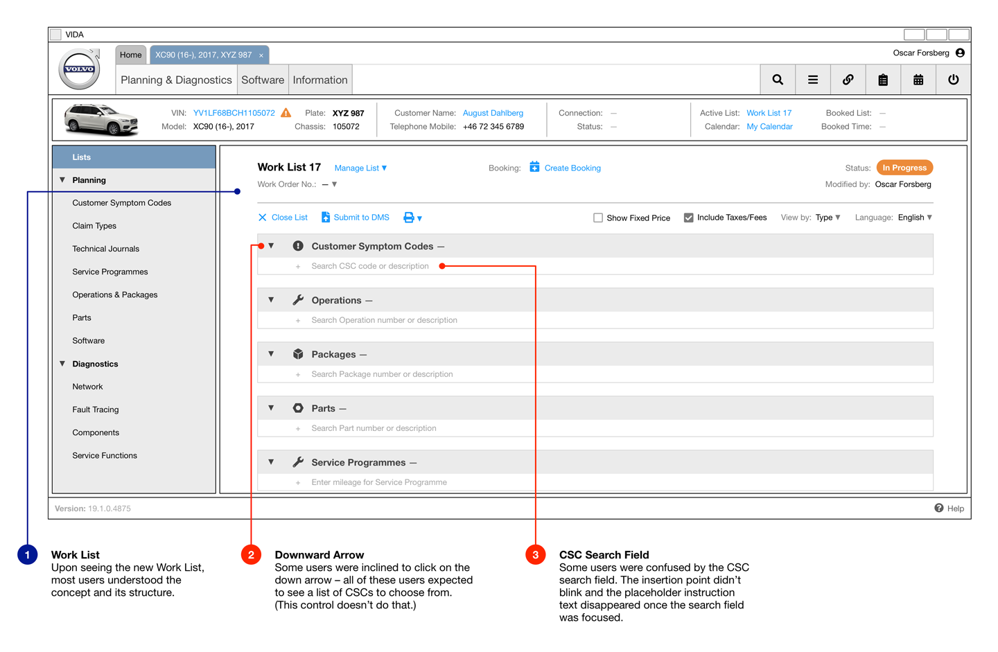
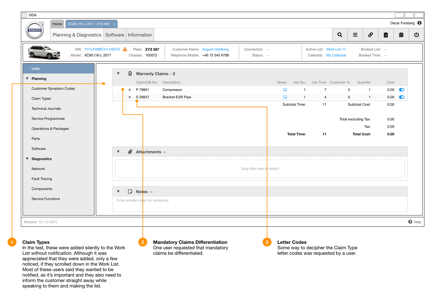
The Work List was a kind of document intended to record all of the details for an instance of servicing work to be done on a customer’s car. The technician would create a Work List when the customer first contacted them with an enquiry. They would add details of the faults they described, fault codes reported by the vehicle itself, parts to be ordered and replaced, checks and repairs to be made, and more. The information to be recorded or attached to the Work List would also need to expand in the future to include vehicle condition reports (photos, video, readings), check lists, and more. It also contained itemised pricing information, forming the basis of the customer’s invoice and serving as a legal record of the work carried out.
The existing Work List functionality had numerous usability and technical issues which needed to be addressed and improved upon in order to better serve the technicians using it. Some of these were:
I developed wireframes for VIDA (particularly in the Work List) to address usability problems and where processes could be made more efficient for technicians.
Furthermore, I was involved in the development of concepts for new areas of functionality to be offered within VIDA. As these were particularly complicated integrations, this required several discussions and coordination between various stakeholders, including a third-party application vendor. I created visualisations for how these integrations could be achieved in the existing application framework.


Specific areas of functionality in the new application workflow were prioritised for validation. In order to validate the design of these, I created an interactive prototype for user testing. This was made in Proto.io, based on the wireframe screens with various elements made interactive. These formed the basis of a test scenario that would ask the user (technician) to perform a typical series of tasks for a customer whose car needs servicing.
At this point in time, we had hired a second user experience designer to the team, and together we carried out in-person interviews and user testing of the prototype.
One of the first target markets for launching the new functionality was Germany, so the first round of testing took place at 2 workshops there, with a total of 7 users covering 2 different user types. I had all of the prototype interface text translated, and made a German version for the user testing. We had a translator for our interviews with the test subjects, although all of the technicians understood basic English so we could often speak directly.
From the user testing, it was possible to validate that certain new concepts were working effectively, and identify areas where users still encountered problems. I was then able to address these in further iterations of the designs.
As the user testing took place within an interview context, we were also able to uncover other issues and insights into the technicians’ broader workflow while using the software. These insights were collated and reported back to the business and development teams for ongoing improvement.


In the 6 months that I was contracted with the VIDA team, I was able to improve several areas of the application, the most significant of which was the Work List redesign. The development teams proceeded with implementing the new designs, deploying them within their normal testing and release cycles. I was able to work directly with the developers during the first stages of this, so that they could confidently proceed with the full set of functionality over the following months.
After demonstrating the value of full-time user experience design within the team, I assisted in the hiring of 2 new user experience designers to the VIDA team. This established a permanent UX operation to continue beyond the conclusion of my contract.